
Case study: Sendible
Tagline: Landing page design
Company: Sendible
Platform: Responsive Website
My Role: Product / Marketing Designer
Industry: Social Media Management
Tools used: Sketch, Miro board, Photoshop, Adobe XD, Notion
URL: www.sendible.com
Time: 5 days
Table of contents
Introduction
My Role
Problem
Goal
User Research
Early Ideation
Final Designs
Future Steps
Intro
Sendible is the leading social media management platform for agencies looking to manage social media more effectively for their clients.
In the new landing page, the idea is to increase the number of free trials so users can test the product before purchasing.

-
My Role
I led the research, insights, ideation and prototyping of this project from end to end.
-
Problem
The landing page doesn't drive the number of free trials that the team believes it should.
-
Goal
Increase free trial sign-ups
By showcasing the features to agencies, marketers and brand managers who want to use Sendilble to grow their business.
My focus was on the section above the fold and the next section...
💎
I’ve used The Double Diamond design thinking model to create a map to organize my thoughts to improve the creative process.
User Research:
Understanding the user
Who is Sendible made for?
Sendible is made for people behind social media management agencies and small businesses.
What are the pain points of Sendible's users?
The article on Social Media Pro suggests there are 6 MAIN pain points that social media managers face constantly.
1 - Measuring and showing ROI of social media.
2 - Time management and resource management
3 - Consistently creating content
4 - Fighting online distractions
5 - Creating real engagement
6 - Creating videos
By looking at these points I see three of them standing out as that’s where Sendible serves its solutions.
-
By helping to show the user's value to clients and team members.
-
By helping managers to save time when planning, creating and scheduling content.
-
Allowing to monitor brand mentions on socials.
Persona
Where are the users on their journey?
Discovery phase
What are the Touchpoints?
Social media
Rating and reviewing websites
Testimonials
Word of mouth
Community involvement
Marketing
What other information they have seen from Sendible?
Have heard about it but don't know much.
How would they get to the landing page?
By searching it on Google
Storyboard

QUESTION
What would STOP a marketer from signing up for a free trial on Sendible?
And that got me thinking…
The How Might We methodWith all this in mind I used the How Might We (Como poderíamos...), which is a design thinking method that helps me to generate creative solutions while keeping me focused on the right problem to solve.
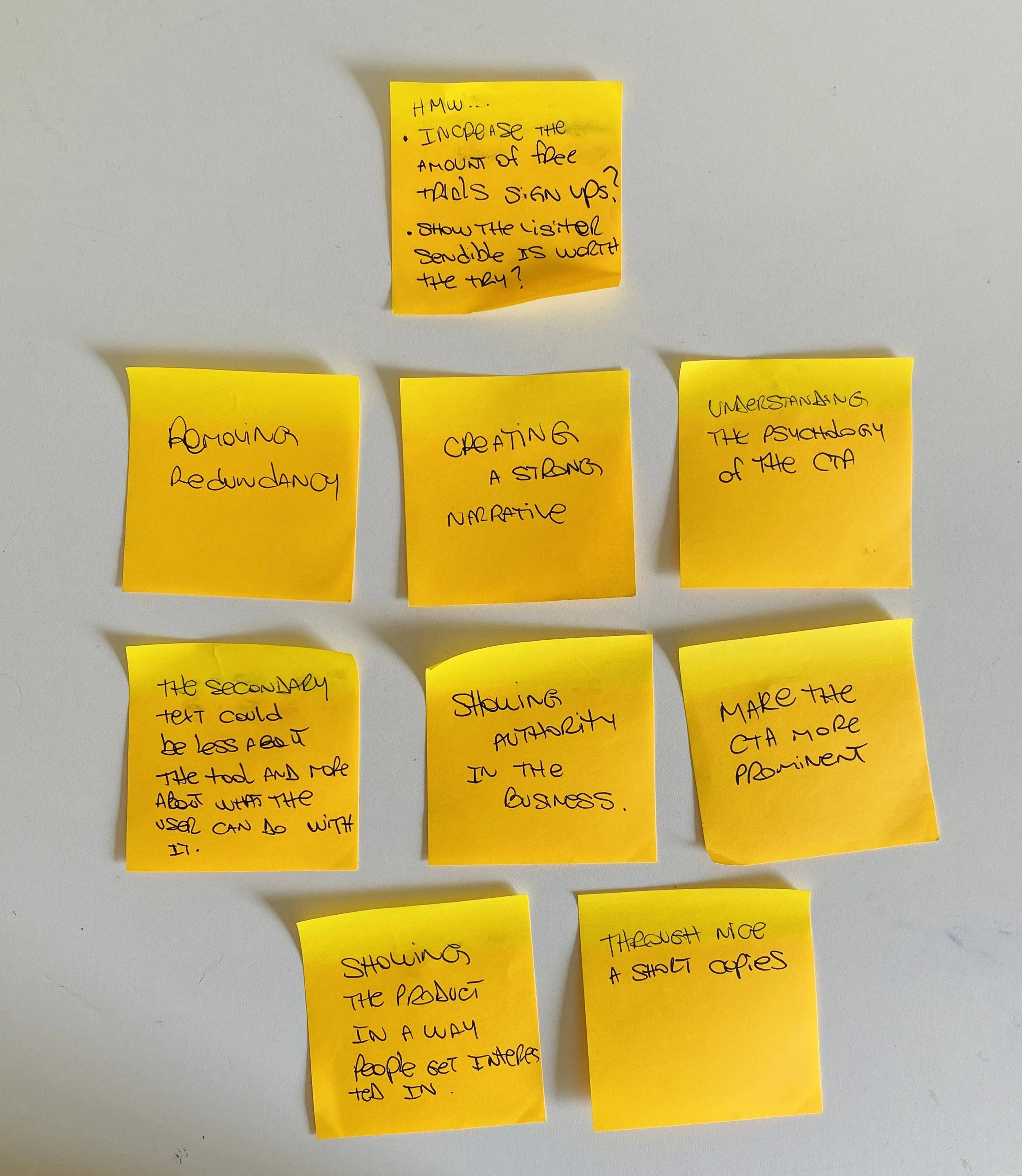
Post its that resulted from the exercise.
Insights:
Generating Ideas
By looking at Sendible's current homepage I took some notes about how I perceived the product and what I thought could be better

Design critiqueI felt there was some redundancy.
The copy could be more simple, insightful and shorter.
The main CTA could look more like a button.
The supporting text could be less about the functionalities and more about how it can help users.
Incorporate elements that would help the decision-making process.
Specific Problem
Based on all these findings, I focused on the idea that the user doesn't know enough to start a free trial.

So a good way to solve this would be to incorporate elements like an explainer video and some screenshots of the system, based on the premise that showing a little but not much would get the potential user curious enough for signing up for a free trial.
Work on the Call to Action.
Another way would be to help the decision making by showing some authority on the field.
Early Ideation
I used the Miro board to gather inspiration on how other tools and forward-thinking brands craft their landing page, and I took notes on what I like about them.

I’ve established 4 design principles for the landing page to make sure I design based on these principles. These principles are centred around Sendible's customers — How I thought customers portray Sendible as a brand.

I started sketching some ideas. My focus at this stage is to jot down what I've learned and how I thought that could be structured.

wireframesThis is how the early wireframes looked like. On the left, I defined the purpose of each section, aligning with our design principles.
The primary goal is to convince users to sign up for a free trial.

I then turn these early ideas into high fidelity designs.
I decided to focus on the structure first before bringing in the colours and thinking about potential shapes.
In my experience, things can get messy and confusing when incorporating colours too soon so I like to focus on hierarchy and on seeing how all the elements work as one first.


Possible solutions backed up by researchEliminate redundant information
According to what I found during the research, Facebook, Instagram, Twitter and Pinterest are today among the most used social platforms. So I assume that when thinking of social media, these names will automatically rise in the user’s mind.
So I believe that having the social media icons AGAIN when mentioning integrations is redundant.

Source: https://ourworldindata.org/rise-of-social-media
Make the CTA more obvious
According to Neil Patel, it's important that the CTA looks like a CTA
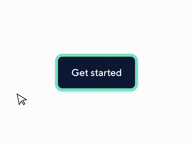
“You want to make sure that people’s perceptual set matches what you put in their line of vision. Make your button look like a button”
— Neil Patel, bestseller author
Promote curiosity
Explain some, but not all, of what a user will see or experience after the CTA. Give them an idea, but no specifics.


The product belongs to you but the decision belongs to your users.
According to this A/B testing experiment, while second-person language works for addressing your readers in the text, you should switch to first-person language on your CTAs.

“we saw a 90% increase in click through rate when we tested Get my free 30-day trial against Get your 30-day trial.”
— WebFX team
The Authority Principle
We can use the principle of authority to help alleviate the strain of decision-making.
By reducing the effort required to make a decision (and then reaffirming that decision), we can increase user confidence and empower our customers.
Before and afterBefore the redesign, I felt like there was a few redundant points.
The first and second sections didn't say much about the product. I found it a bit technical and focused on the functionalities rather than on how they could solve the user’s problem. It does not do justice to Sendible's value proposition as it seemed too distant.
So what I tried to do was to refine those edgy bits, add some emotion yet in a direct and simple way while making sure the designs were consistent and cohesive with Sendible's branding.

Final Designs


Future Steps
Here's what I would focus on now
Ideate and create a video focused on the functionalities and how it will benefit the customer
A/B testings for idea validation
Update the rest of the landing page