Onboarding redesign
A well-designed onboarding builds trust, reduces confusion, and accelerates user adoption. That ensures users understand value quickly and stay engaged.
Think about it… This is the first interaction a user has with a product. It has to tell the story about how the product can add value to a user's life in a short, clear, and memorable way so they simply remember to come back.
The problem
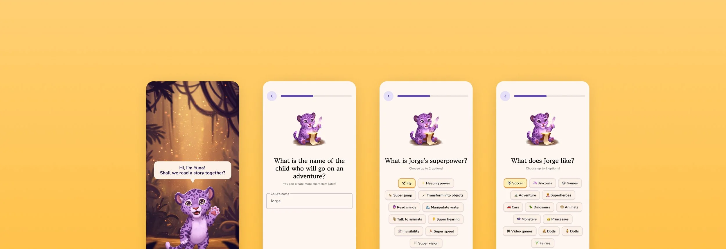
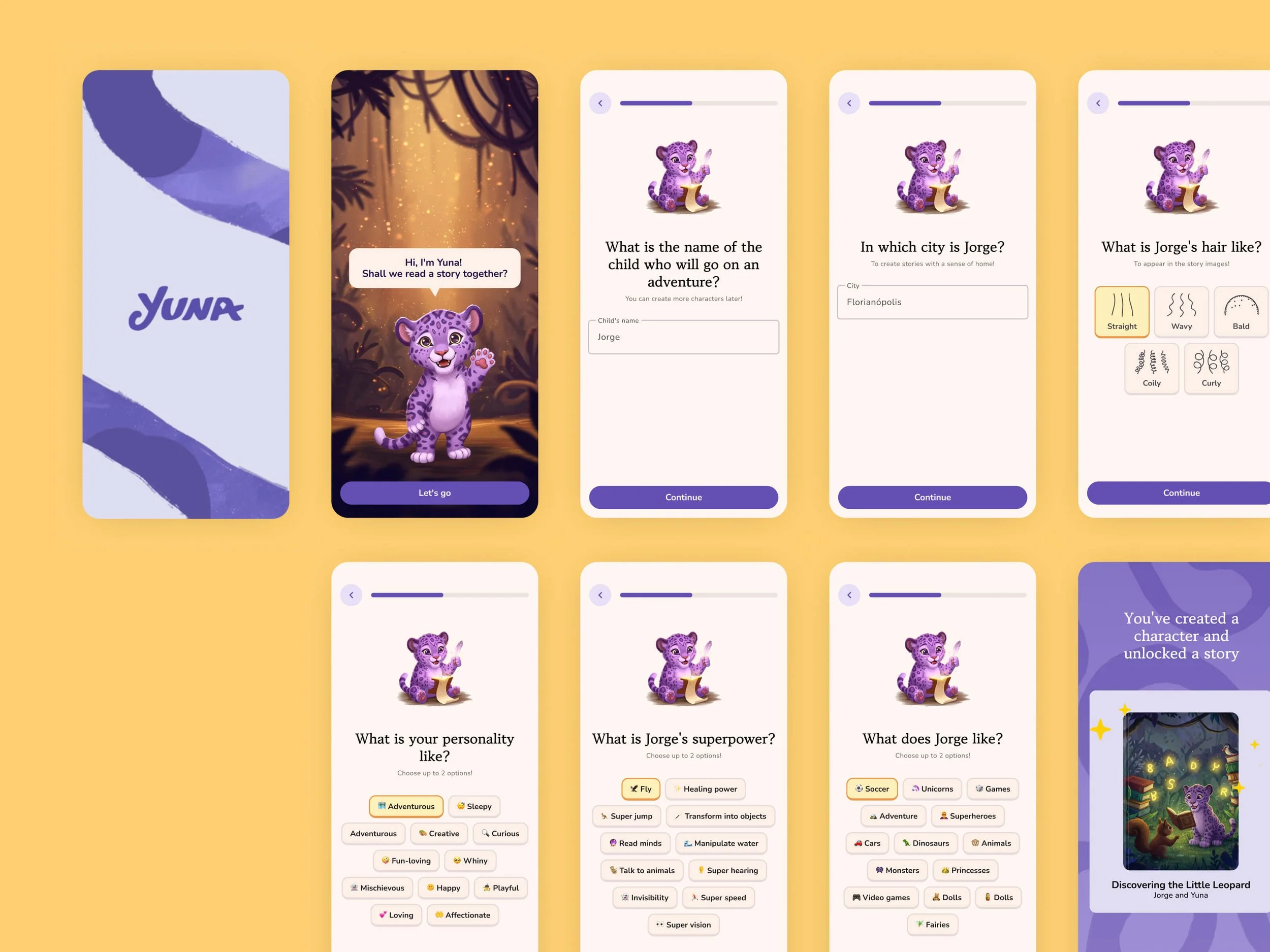
Our onboarding was boring. The data collection form was hard to complete, especially for kids that are in the process of learning to read. It required a lot of effort before users could have a taste of how Yuna could benefit their lives.
The goal 🎯
Our main goal in terms of metrics was to increase retention. So designing a delightful first experience was crucial to keep pushing the bar up.
Initiatives
Introducing splash screen
Clearly showing and telling the benefits the app has to offer
Removing the obligation to sign in
Replacing text-heavy screens with screens that were easy to digest
Improving the data collection form — critical to create those personalized stories
Creating a connection by bringing Yuna — the mascot — to life and introducing moments of direct interaction
Introducing sounds and haptics to create engagement, creating a multi-sensorial experience
Replacing boring drop-downs with chip selection
Adding a progress bar as users move forward
Concerns
When Julia (product designer) and I were designing this new flow, we were a bit apprehensive about increasing the number of screens. After all, some of us on the team had the old belief that fewer clicks is better for usability.
This belief came from early usability thinking, where reducing the number of clicks was seen as reducing user effort.
In theory, fewer clicks meant less friction and faster access to goals.
But the flaw in that thinking is this: it assumes all clicks are equal.
They are not.
Modern UX research shows that users don’t mind clicking more if the path is clear, intuitive, and feels like progress.
In fact, trying to cram everything into fewer steps can overwhelm users, confuse them and make interfaces harder to navigate.
So we conducted a perception test with a few families.
We looked at how long they took to complete the new flow, their expressions and feelings, and how likely they were to continue after the key steps were completed. We also listened to their feedback.
This step was very important because we saw how kids and mothers enjoyed — and even smiled — while completing our new onboarding flow.
It gave us the confidence we needed to see that we were heading in an interesting direction.
So we implemented it
Results
The A/B test showed that users who completed the new onboarding were more likely to create and read a new book.
Those who read a new book were more likely to return within 7 days.
And we significantly reduced the drop-off rate.
A happy extra result was that users started asking to interact with Yuna at other moments in the app.
So we listened! :)
And I explain how we did this in the case study "Bringing Yuna to life”